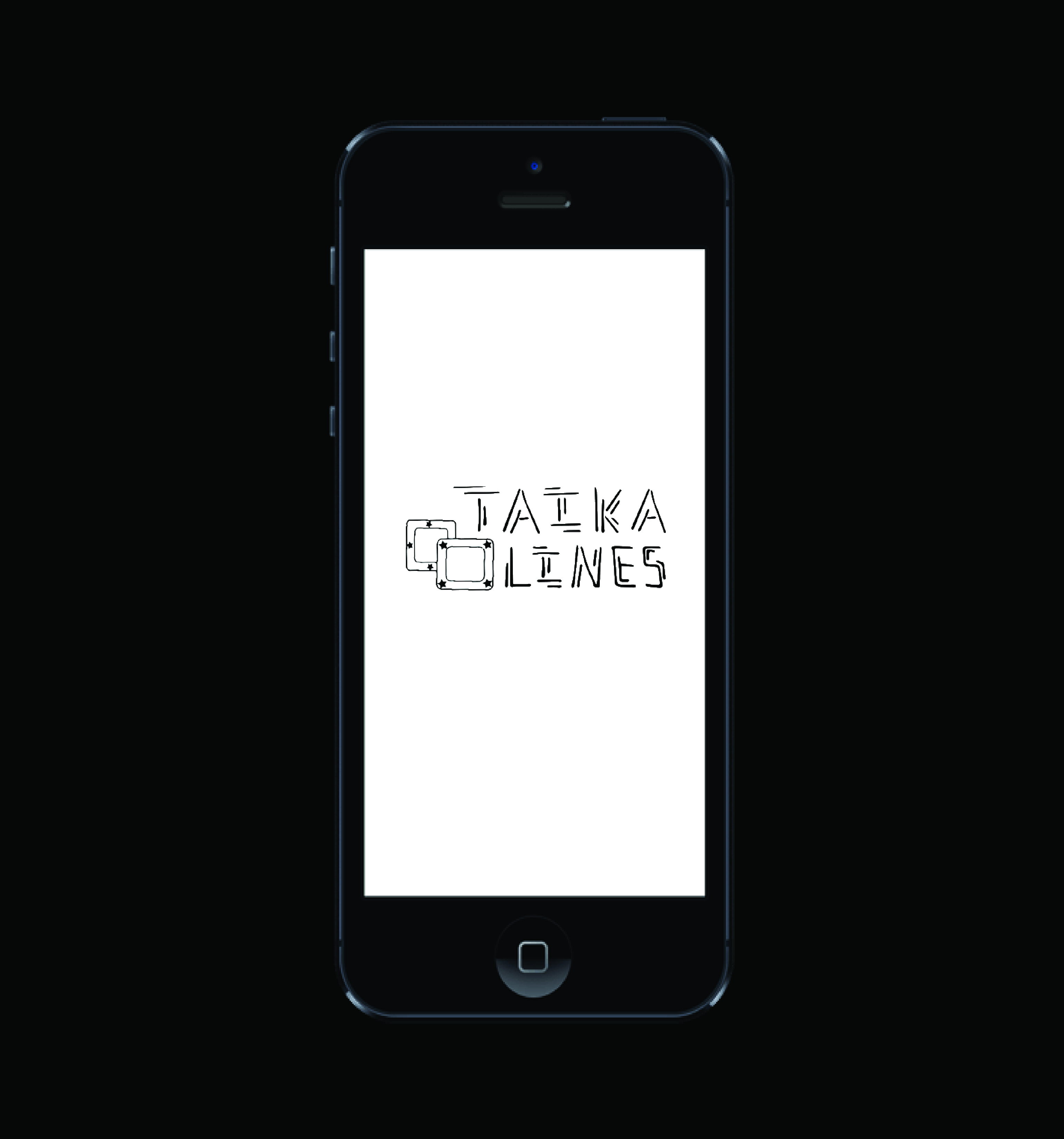
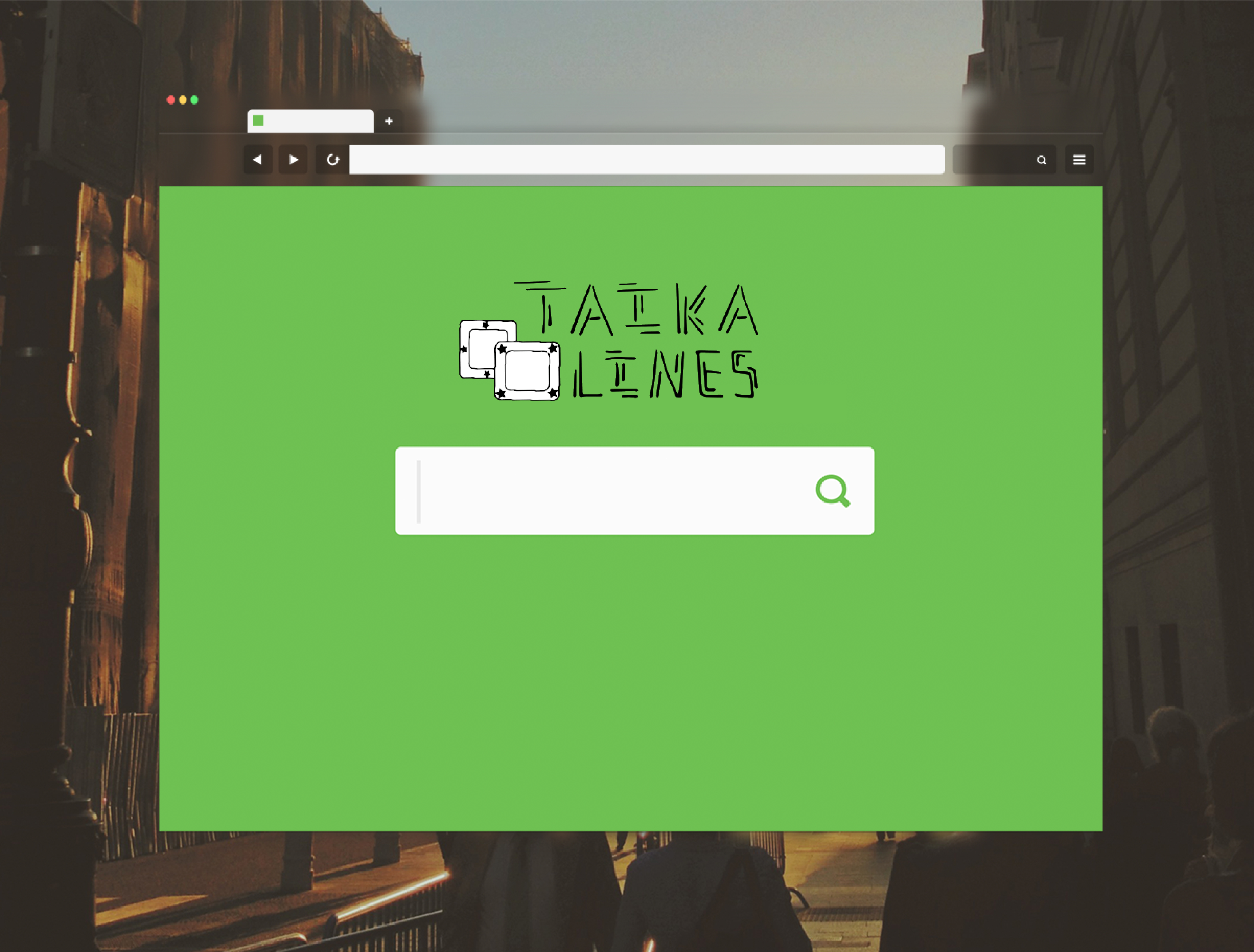
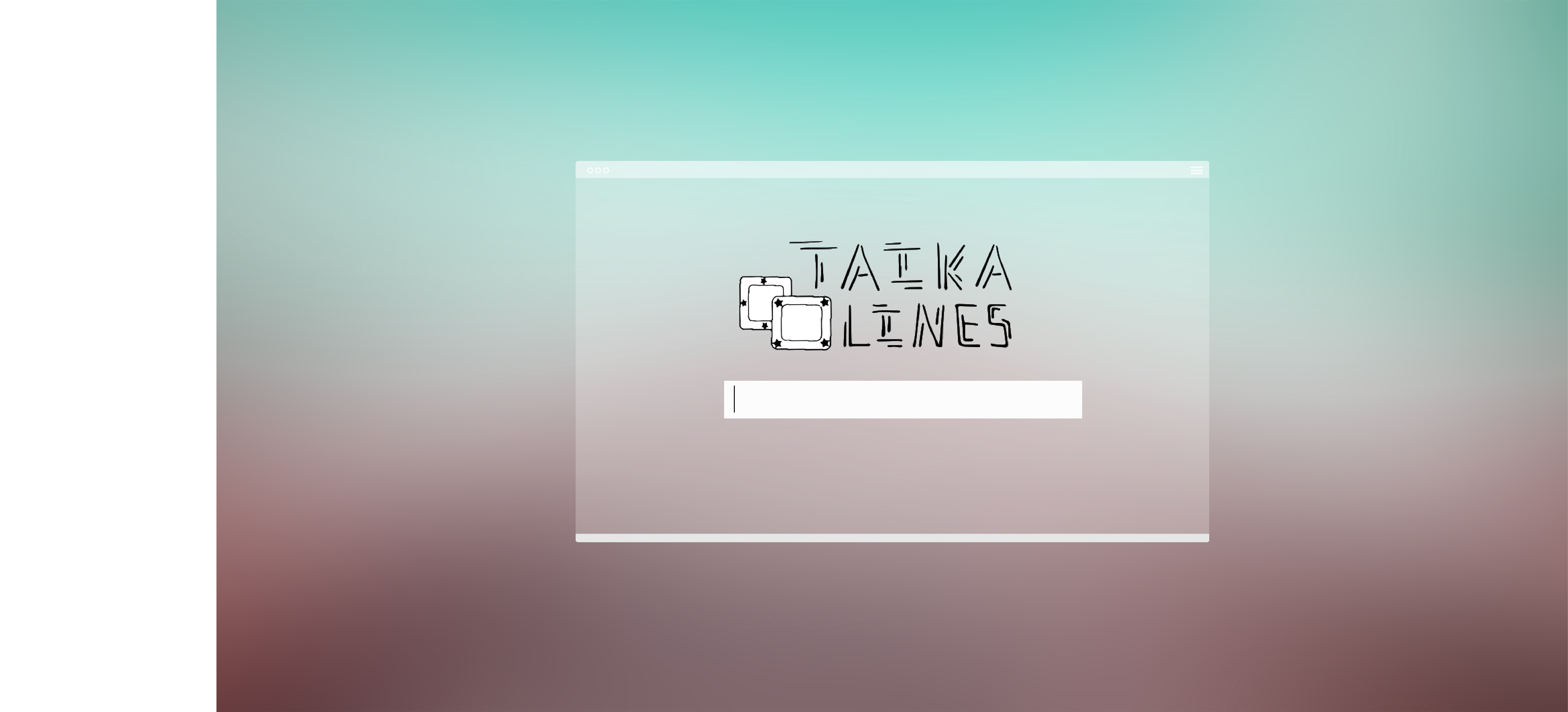
My logo design mockups went well overall. My favourite one is the phone one on the left. The blackness of my logo matches the black background and the logo also fits well on the phone. As for the middle mockup, green and black seem to clash, so the cohesion is not as good. The one on the right gives my logo a dreamy feel, which is partially accurate because 'TAIKA' in my logo means "magic," but the font type doesn't fit that background. Overall, mockup cohesion worked well due to color and atmosphere harmony. Perhaps the arrangement of my two words in the logo still appears to be a bit disorganized and chunky, though. This is a skill I will work to develop in future assignments.
0 Comments
|
AuthorHello! Just a West Vancouver gal meandering through the unpredictable tides of life. Archives
May 2018
Categories |
 RSS Feed
