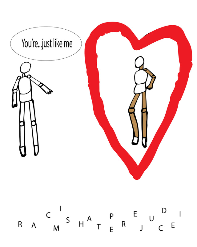
 I had a shorter amount of time completing this project, since I was concentrating on my 36 Days of Type for the art show, but it turned out well. The mix of hand-drawn and Adobe Illustrator elements works. When viewing this piece, I hope my viewers understand the message: when getting to know a person's true self (symbolized by the heart), physical appearance (skin color for example) doesn't matter in the grand scheme. To my relief, the letters beneath the people clearly spell out 'racism', 'prejudice', and 'hate' like I had intended. The heart is rather rough and might look better with cleaner lines, but it doesn't hinder my project significantly. As well, the people were drawn in simple ways. The minimalist vibe the piece exudes makes this decision fit, though. Overall, my social political project is successful and I am happy with it.
0 Comments
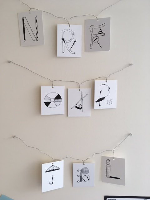 My 36 Days of Type project, which I showcased in the Bloom Art Show, was a success. I was able to explore new and fascinating ideas previously left untouched. As I mentioned in my Artist Statement, I used lines and shading to create a sense of unity among the pieces. My use of everyday objects, from a Swiss army knife to pencils, demonstrates even the mundane aspects of life can be morphed into creative art, letter art in this case. As for my method of showcasing, hanging the letters using wires and pins matched the feel of my project because my letters are not stiff and formal. The colours of the wires is also almost identical to the white of the papers. One part of the project I will seek to improve is how recognizable the letters are. One of my other teachers thought my tennis racquet and ball piece was an I instead of a B. I will definitely attempt 36 Days of Type in future years to further delve into unfamiliar areas and mediums of art.
|
AuthorHello! Just a West Vancouver gal meandering through the unpredictable tides of life. Archives
May 2018
Categories |
 RSS Feed
