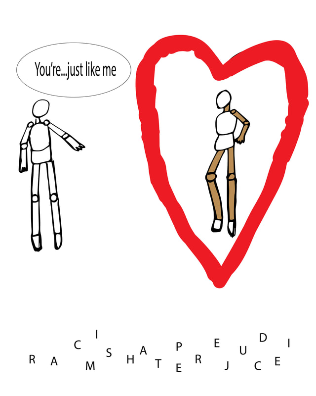
 I had a shorter amount of time completing this project, since I was concentrating on my 36 Days of Type for the art show, but it turned out well. The mix of hand-drawn and Adobe Illustrator elements works. When viewing this piece, I hope my viewers understand the message: when getting to know a person's true self (symbolized by the heart), physical appearance (skin color for example) doesn't matter in the grand scheme. To my relief, the letters beneath the people clearly spell out 'racism', 'prejudice', and 'hate' like I had intended. The heart is rather rough and might look better with cleaner lines, but it doesn't hinder my project significantly. As well, the people were drawn in simple ways. The minimalist vibe the piece exudes makes this decision fit, though. Overall, my social political project is successful and I am happy with it.
0 Comments
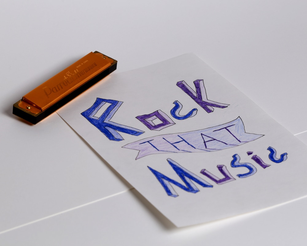
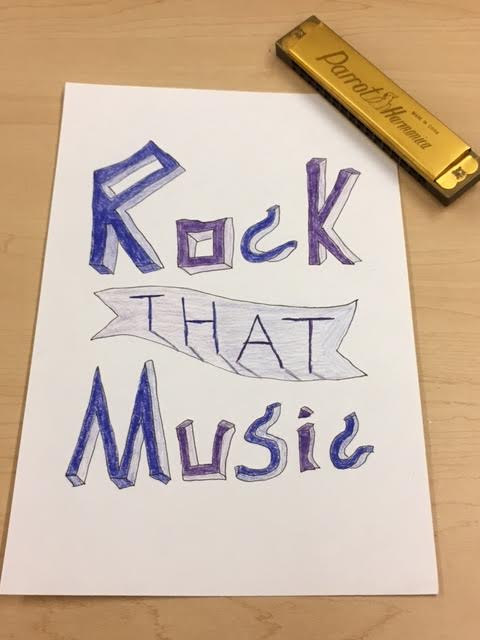
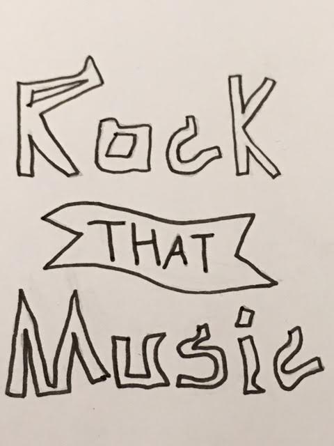
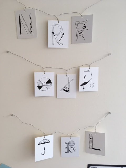 My 36 Days of Type project, which I showcased in the Bloom Art Show, was a success. I was able to explore new and fascinating ideas previously left untouched. As I mentioned in my Artist Statement, I used lines and shading to create a sense of unity among the pieces. My use of everyday objects, from a Swiss army knife to pencils, demonstrates even the mundane aspects of life can be morphed into creative art, letter art in this case. As for my method of showcasing, hanging the letters using wires and pins matched the feel of my project because my letters are not stiff and formal. The colours of the wires is also almost identical to the white of the papers. One part of the project I will seek to improve is how recognizable the letters are. One of my other teachers thought my tennis racquet and ball piece was an I instead of a B. I will definitely attempt 36 Days of Type in future years to further delve into unfamiliar areas and mediums of art.
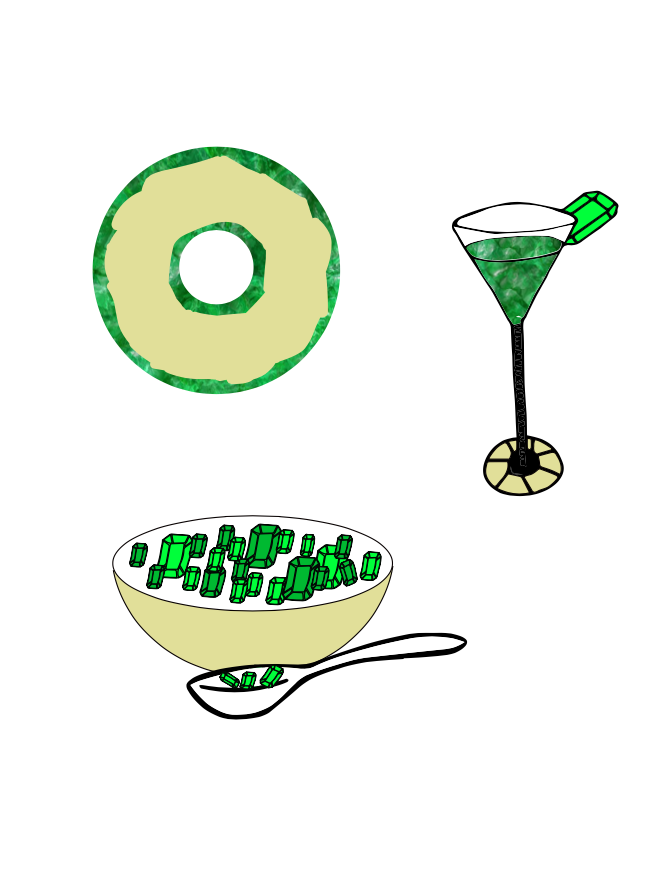
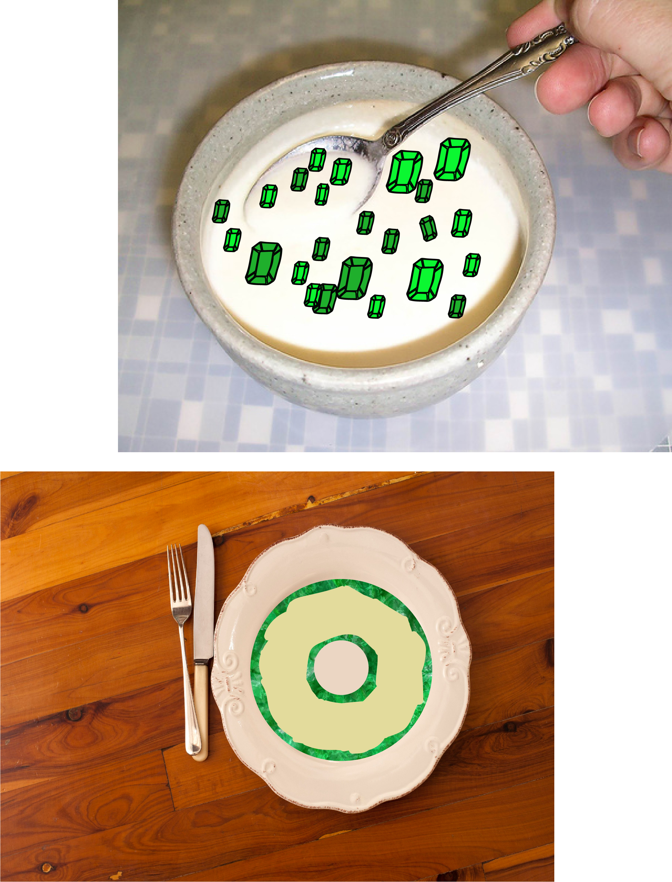
My project features food made out of emeralds, which is a unique and innovative concept since jewels and food are not normally seen together in one piece. The second version mixes handmade and digital media (the emeralds) with photographs. This is another innovative feature I have employed. I am more satisfied with the second version than the first due to the inclusion of both innovative features mentioned above. Unfortunately, the cocktail didn't make it to my second version because shaping the green liquid in the glass was too tedious of a process.
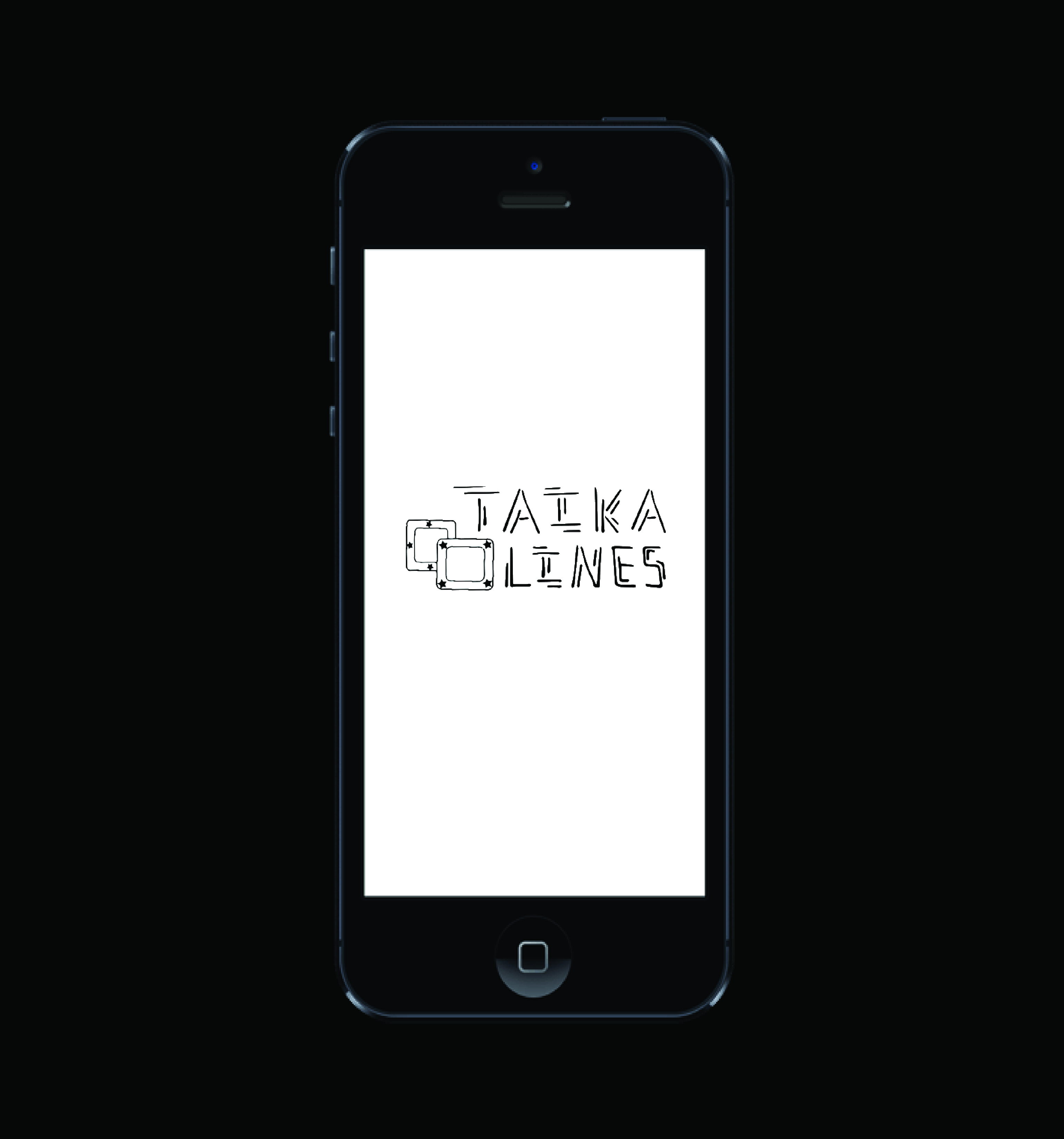
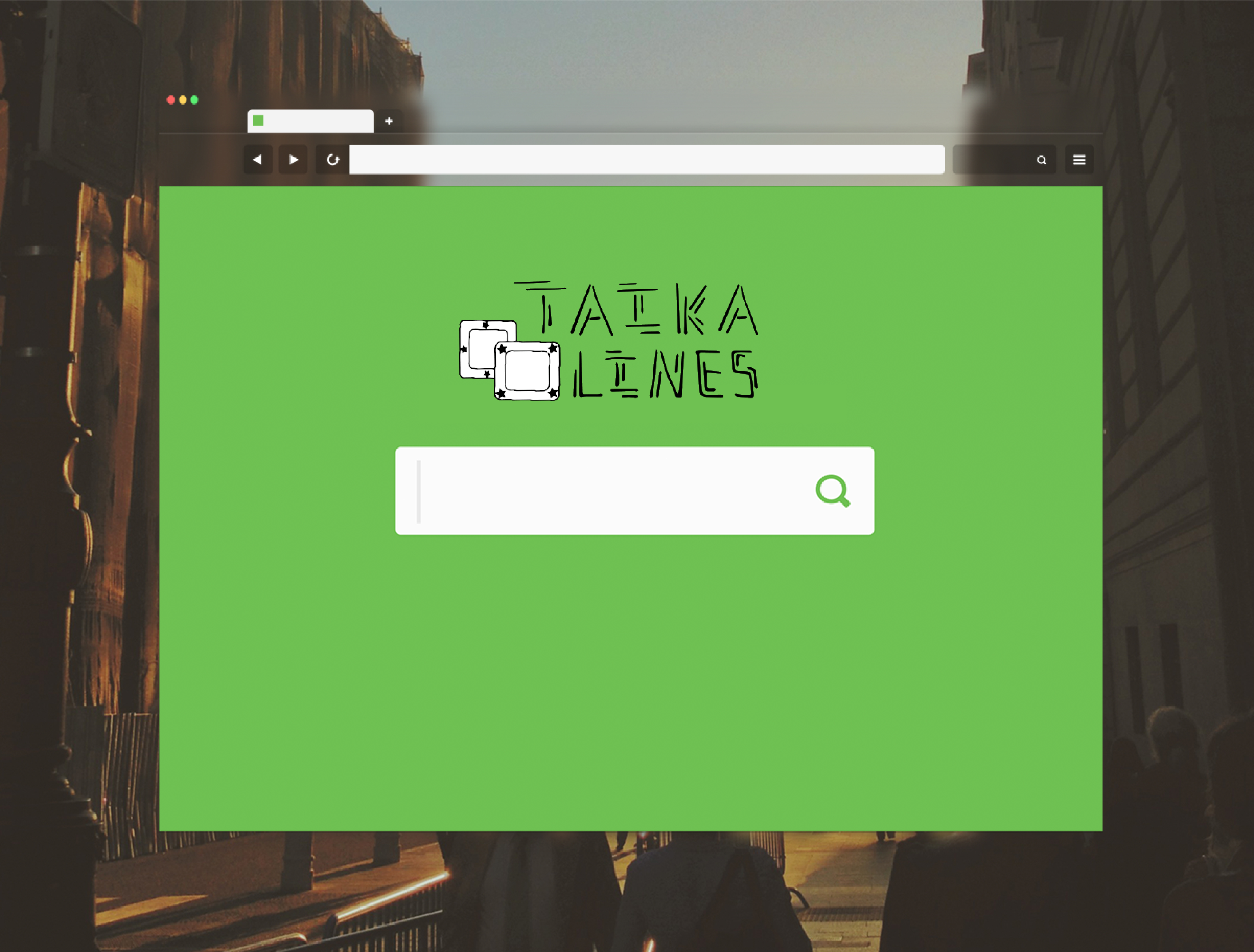
My logo design mockups went well overall. My favourite one is the phone one on the left. The blackness of my logo matches the black background and the logo also fits well on the phone. As for the middle mockup, green and black seem to clash, so the cohesion is not as good. The one on the right gives my logo a dreamy feel, which is partially accurate because 'TAIKA' in my logo means "magic," but the font type doesn't fit that background. Overall, mockup cohesion worked well due to color and atmosphere harmony. Perhaps the arrangement of my two words in the logo still appears to be a bit disorganized and chunky, though. This is a skill I will work to develop in future assignments.
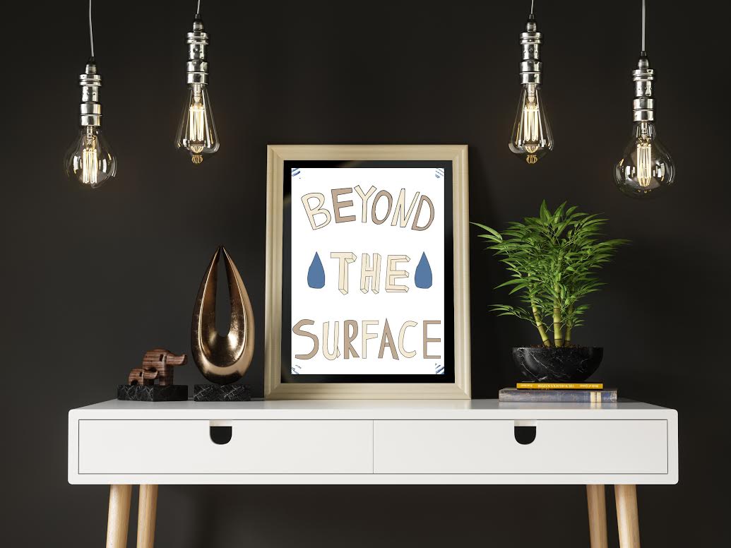
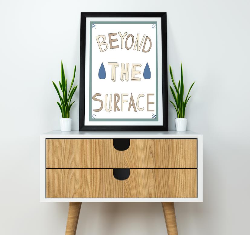
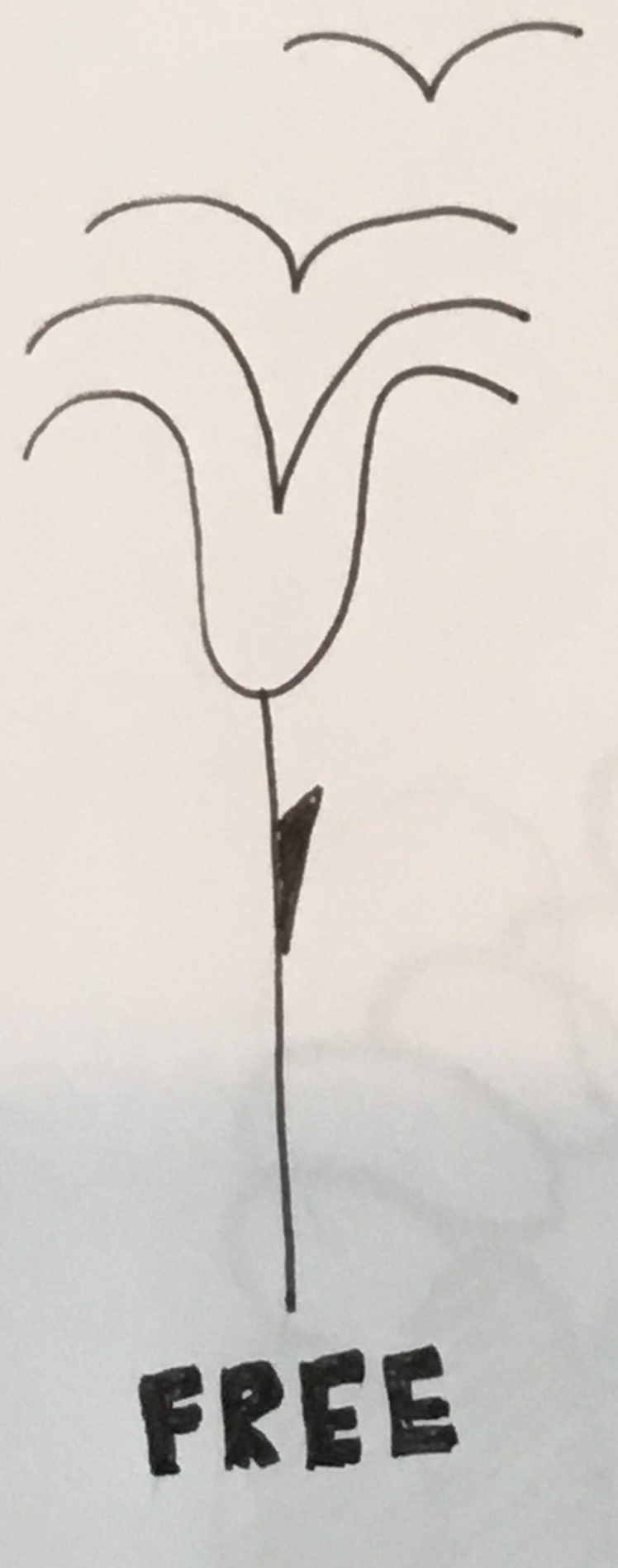
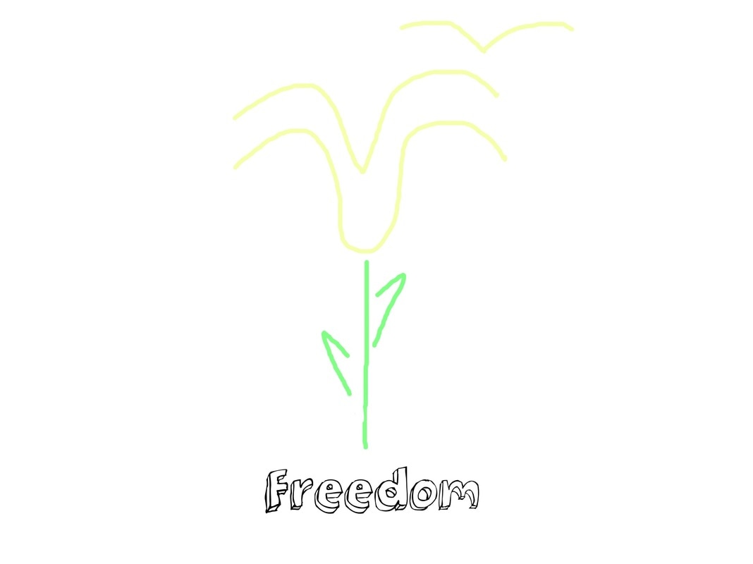
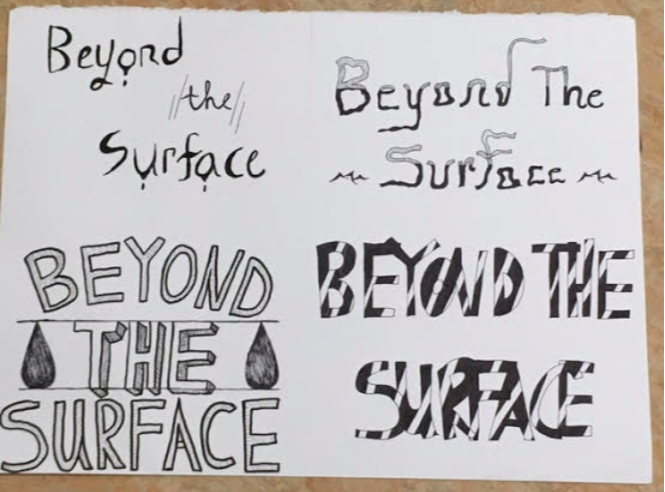 My project was the result of several creative ideas and risks. The styles of each phrase are distinct from each other and I believe all of them turned out as I imagined. The one on the top right and the one on the lower right are my favourites because they challenged me to step out of my comfort zone and enhance my lettering skills (thick vs. thin; spacing between letters). The part of the top right one I like the most are the tiny waves and how the letters seem to be sinking. This concept works to highlight the meaning of the words I chose. However, for all of the four designs, I didn't take into consideration how they would look from far away. The top two designs are smaller and a bit weaker when observed from afar, since they don't have capital letters. However, in terms of cohesion, I feel all four had an element that unites the words, the big one being the font. Overall, I am pleased with this project and plan to experiment with hand lettering even further in the future. My blog header assignment yielded intriguing results. I decided to go with a wavy, dreamy font to represent the introspective nature of my blog and me. The words, 'MURMURS OF THE MIND', reflect the content of my blog, which will be filled with thoughtful, unconventional artwork and ideas. It also reflects their uninhibited nature, since I will pursue any idea I believe in no matter how 'weird' it may seem. This assignment helped me learn how to step out of my comfort zone and experiment with exotic fonts (no straight lines or order). This is something I will continue to do throughout the year. One area up for improvement is my use of negative space. In the blog header, the words are close to each other, perhaps too close. I could've moved 'MURMUR' a little more to the right and 'MIND' more to the left. It's hard to say, though. 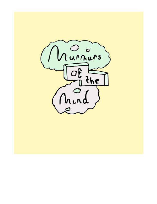 As for my personal narrative, I might stick to hand lettering and/or drawings and play with a few words that mean a lot to me. I have done some 3D lettering last year, but I might incorporate a little of it again. Or, I might continue exploring unconventional, less 'perfect' fonts. My project will certainly have an abstract quality to it, since I am not someone who likes actual representations of reality or the like. The goal of my personal narrative piece is to reveal the inner workings of my imagination and I won't hold myself back.
Caledonia Curry caught my attention. Her art evokes a plethora of emotions and contains even more ideas and interpretations. They may look easy to understand at first sight, but upon further observations, inner layers appear. I want my art to be this way as well. |
AuthorHello! Just a West Vancouver gal meandering through the unpredictable tides of life. Archives
May 2018
Categories |
 RSS Feed
