|
My blog header assignment yielded intriguing results. I decided to go with a wavy, dreamy font to represent the introspective nature of my blog and me. The words, 'MURMURS OF THE MIND', reflect the content of my blog, which will be filled with thoughtful, unconventional artwork and ideas. It also reflects their uninhibited nature, since I will pursue any idea I believe in no matter how 'weird' it may seem. This assignment helped me learn how to step out of my comfort zone and experiment with exotic fonts (no straight lines or order). This is something I will continue to do throughout the year. One area up for improvement is my use of negative space. In the blog header, the words are close to each other, perhaps too close. I could've moved 'MURMUR' a little more to the right and 'MIND' more to the left. It's hard to say, though. 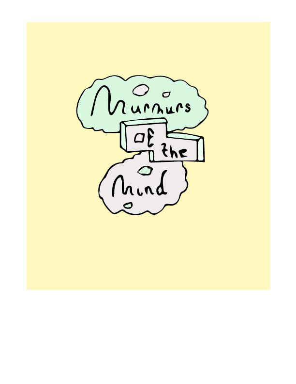 As for my personal narrative, I might stick to hand lettering and/or drawings and play with a few words that mean a lot to me. I have done some 3D lettering last year, but I might incorporate a little of it again. Or, I might continue exploring unconventional, less 'perfect' fonts. My project will certainly have an abstract quality to it, since I am not someone who likes actual representations of reality or the like. The goal of my personal narrative piece is to reveal the inner workings of my imagination and I won't hold myself back.
Caledonia Curry caught my attention. Her art evokes a plethora of emotions and contains even more ideas and interpretations. They may look easy to understand at first sight, but upon further observations, inner layers appear. I want my art to be this way as well.
0 Comments
Leave a Reply. |
AuthorHello! Just a West Vancouver gal meandering through the unpredictable tides of life. Archives
May 2018
Categories |
 RSS Feed
