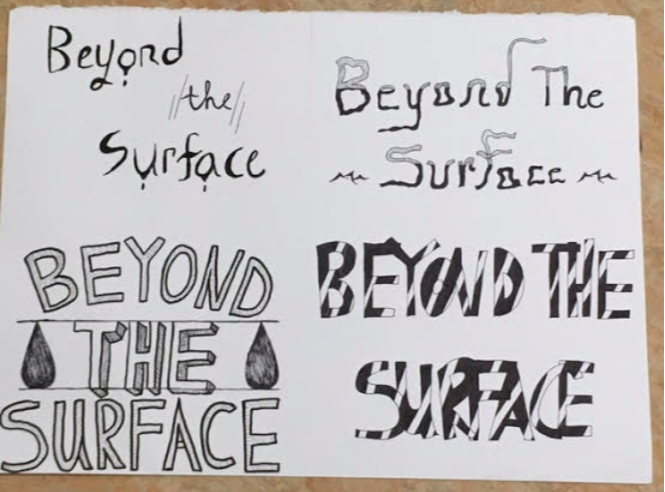
 My project was the result of several creative ideas and risks. The styles of each phrase are distinct from each other and I believe all of them turned out as I imagined. The one on the top right and the one on the lower right are my favourites because they challenged me to step out of my comfort zone and enhance my lettering skills (thick vs. thin; spacing between letters). The part of the top right one I like the most are the tiny waves and how the letters seem to be sinking. This concept works to highlight the meaning of the words I chose. However, for all of the four designs, I didn't take into consideration how they would look from far away. The top two designs are smaller and a bit weaker when observed from afar, since they don't have capital letters. However, in terms of cohesion, I feel all four had an element that unites the words, the big one being the font. Overall, I am pleased with this project and plan to experiment with hand lettering even further in the future.
0 Comments
Leave a Reply. |
AuthorHello! Just a West Vancouver gal meandering through the unpredictable tides of life. Archives
May 2018
Categories |
 RSS Feed
